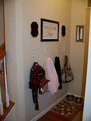
The result? A (nearly) completed
Last Thursday when I was at Lowe's getting some paint, I saw this picture on the discount rack in the back of the store:
It was originally $20, and there was no markdown price on it. One of the employees walked by, and I asked her if she could find out how much the discount was. After looking it up, she said she could give it to me for $10. I said no thanks, I'd be taking it all apart anyway and I didn't want to pay that for something I might ruin. She asked if I'd take it for $7...? Knowing that the size and shape were perfect (even though I had no idea yet what would go in the frame), I decided to take a risk and get it.
When I returned home, I took the frame apart and messed with different scrapbook paper backgrounds and phrases. I really liked the idea of writing, "Home is where you hang your heart" but when I envisioned it right above all of our coat hooks, it didn't seem like a good idea. (Don't let your imagination run too wild on that one.)
I finally decided to go with "Welcome Home," since it is really only an entrance for our family. (Plus I thought it would be nice to be greeted every time I returned home, since my sweet, lazy dog doesn't usually come downstairs.)
Next I had to choose the right size text for the frame. I printed several sizes of text I wrote up in a word processing document.
When I thought I had it right, I decided that as cute as the scrapbook paper background was, it was a bit too DIY-looking for what I wanted. I concluded that my best bet was to paint right on the wall and frame it so it looked like a custom decal.
I really wanted to make the white letter hooks tie in with the dark wood frame and black trays, so I chose to paint a white mat or border inside the frame. Then I got out my trusty carbon paper and pencil and traced the words right onto the wall.
Then, using a teeny-tiny, itty-bitty, totally decent paintbrush, I got to work.
A few times I messed up and dragged my hand through wet paint...
...but it was nothing that a little more paint couldn't fix.
Overall I am super happy with how it turned out! Yay for spending $7!!
The black metal trays hanging on either side of the picture were something I picked up at an antique store more than six months ago. Although I love their shape and the way they fill the space, I think they still need something on them. More letters or numbers would probably be too much, but I haven't been able to think of other good options. I considered painting a symbol, like a fleur-de-lis, but I wasn't sold on the idea. My latest thought is to put an antique skeleton key on each one, but the antique stores around here are out of them. (Everyone is using them for key necklaces!) I could order antique keys from Etsy, but I'm so impatient.
What do you think? What would you do to the trays? Order some keys? Leave well enough alone? Paint something? I would love your suggestions!!
Before:
After:
Every time I look at this, I hear Ty Pennington say, "Welcome home, family... Welcome home." :-)


Melissa,
ReplyDeleteIt looks fantastic. I think the key idea for the black metal trays is great or fill that space with the black/white fabric you were playing with behind the Welcome Home. Buying framed art is a great way to get inexpensive frames. Who cares what the art looks like, just get an awesome frame for cheap. Great job!
Such a great idea. Can't wait to read about the rest of your 2011 home goals!
ReplyDeleteI am also very excited to see what happens in/ to your home in 2011
ReplyDeleteAwh this looks so good! I love it!
ReplyDeleteLooks good! You are so creative!
ReplyDeleteHave you seen this closet makeover into a mini mudroom? I though of this when I saw your "mudroom" hallway and saw you had a closet. Don't know if it is big enough or if you like it but though I'd share:)
http://www.housetweaking.com/2010/07/29/feature-friday-my-mini-mudroom/
Christy -
ReplyDeleteYes, I have, and I LOVE it!! Unfortunately, my closet is not right for something like that at all. Before they framed the house, I was planning to do exactly that type of thing, and I was just going to take the door off. But because of the placement of the door (and the studs), it isn't possible. I let that idea go as soon as the framing was done. :-(
honestly, I LOVE the idea of huge antique keys in there. Buy them in a lighter finish so they pop out against the black trays. Perfect!!
ReplyDeleteI love etsy! go for it girl!!
- {darlene}
fieldstonehilldesign.com
I love your 'welcome home'! What a loving, warm way to greet loved ones. You did such a beautiful job!
ReplyDelete